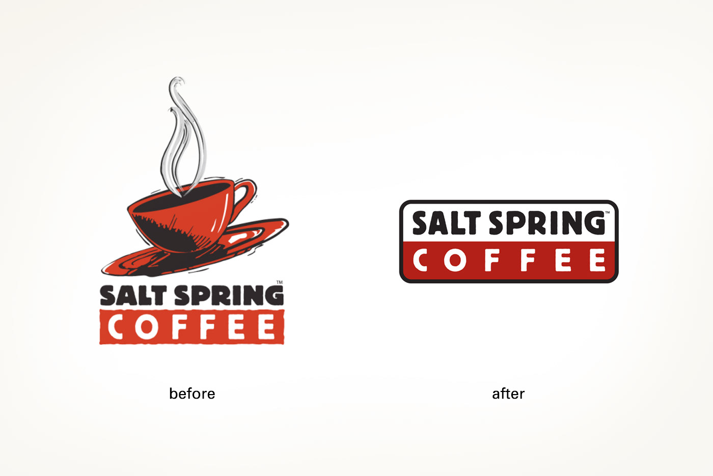
This logo was a bit of a lesson in reductive design. First we removed the cup, which limited its usage both in shape and content, and then we simplified and optimized the logotype, by opening up and lightening the top portion. Then we created a bit more balance between the two halves, enclosed it in a more 'bullet proof' shape, and finally bumped up the red.