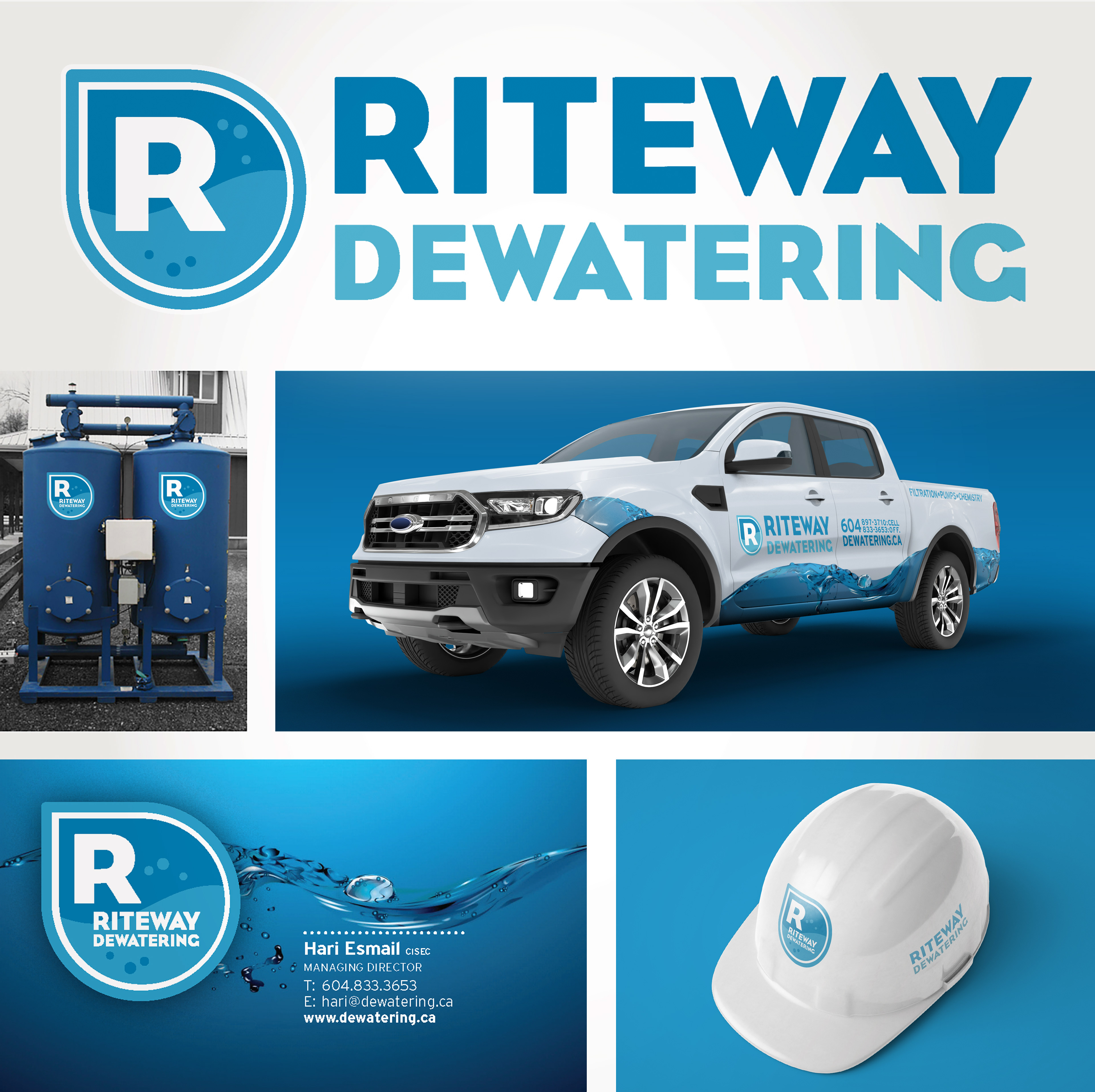
When I designed The Esmail Group's Riteway identity, I knew the owner was working towards a suite of companies + brands. Riteway, the first company, would be about managing water; dewatering, biofiltration and water cleaning for construction sites and the like.
I knew the second company would be about preserving and creating greenery; other future companies would focus on the maintenance + management of other parts of the landscape; like soil, rocks &c. Knowing this allowed me to design all brands to work individually, but also work in a group, from the offset.
When time came to create a visual solution for the 'Mother Brand', The Esmail Group, I was able to design with this future growth in mind. While all brands would share a graphic, friendly simplicity; each would have an indicative icon + colour to help separate them. As I'd already set them up with a few 'base' fonts, I explored those and the use of grey/black as a unifying colour.