THE ASK: The look and feel for Optimi's functional mushrooms marketing material had pretty much been established, and they'd designed the packaging for a number of their products. But they weren't satisfied with the flavour indication on their protein powders, and they wanted some exploratory work done on things like hydrating powder and functional mushroom chocolate. I was the natural choice to help out, as I'd already designed newsletters, advertising and swag for them.
THE BRAND: As I had worked with them previously, I knew that "Optimi seeks to demystify functional mushrooms + strip away complexity + uncertainty" and to come across as "clear, simple, and sleek", "say only what's necessary" and still be "a design the consumer is proud to keep on their counter".
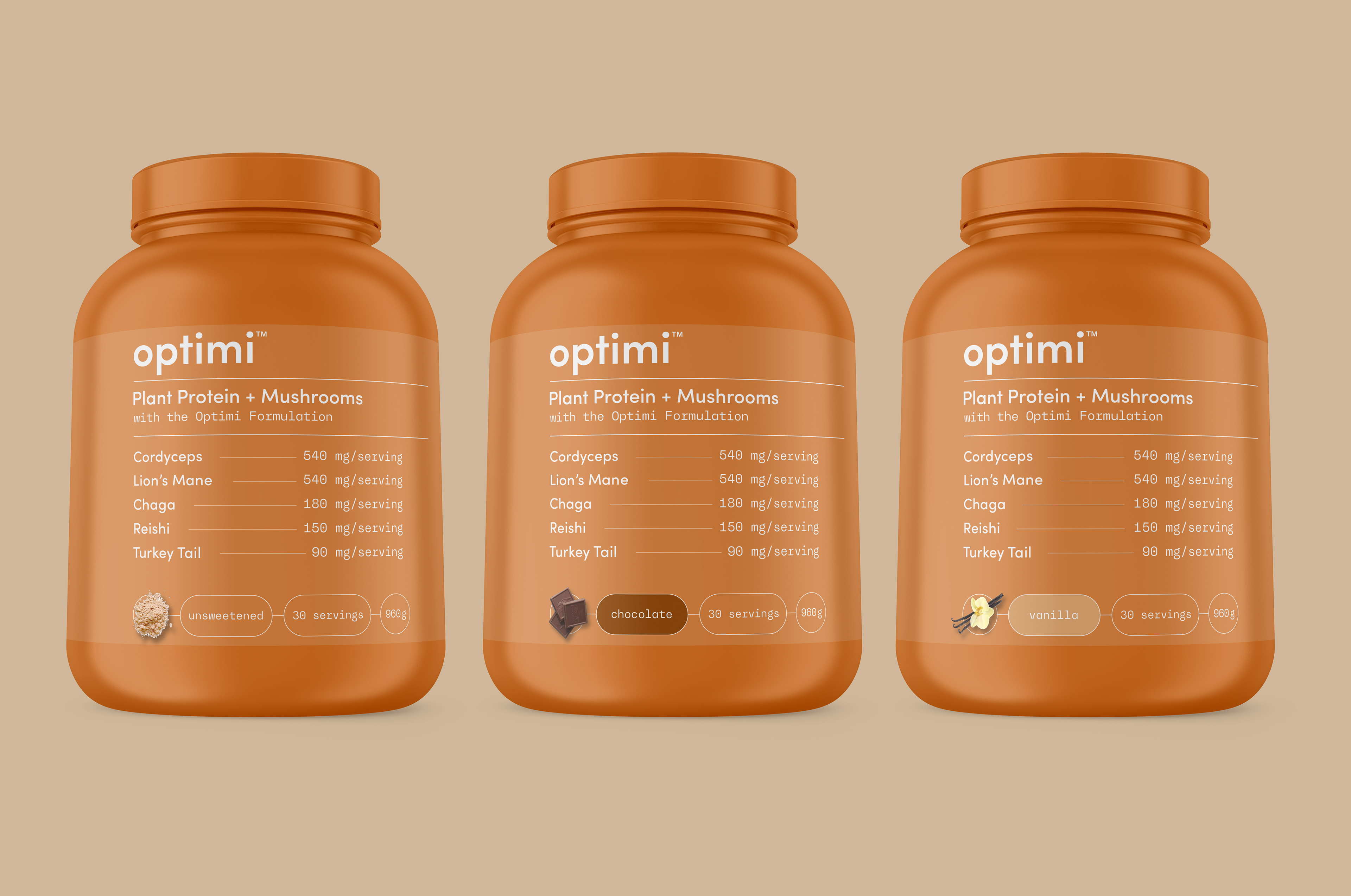
The Protein Powder brief stipulated that for budgetary reasons, we only had the existing label real estate to play with - no different colour lids or bottles to help differentiate the flavours. So I proposed we keep the flavour name near the base, in a signature colour, with a simple flavour cue graphic. Copy and graphics are in the 'Optimi pill' shape, keeping it on brand but setting them a bit apart from other label content. They're large enough to be clear, but still respecting message hierarchy.
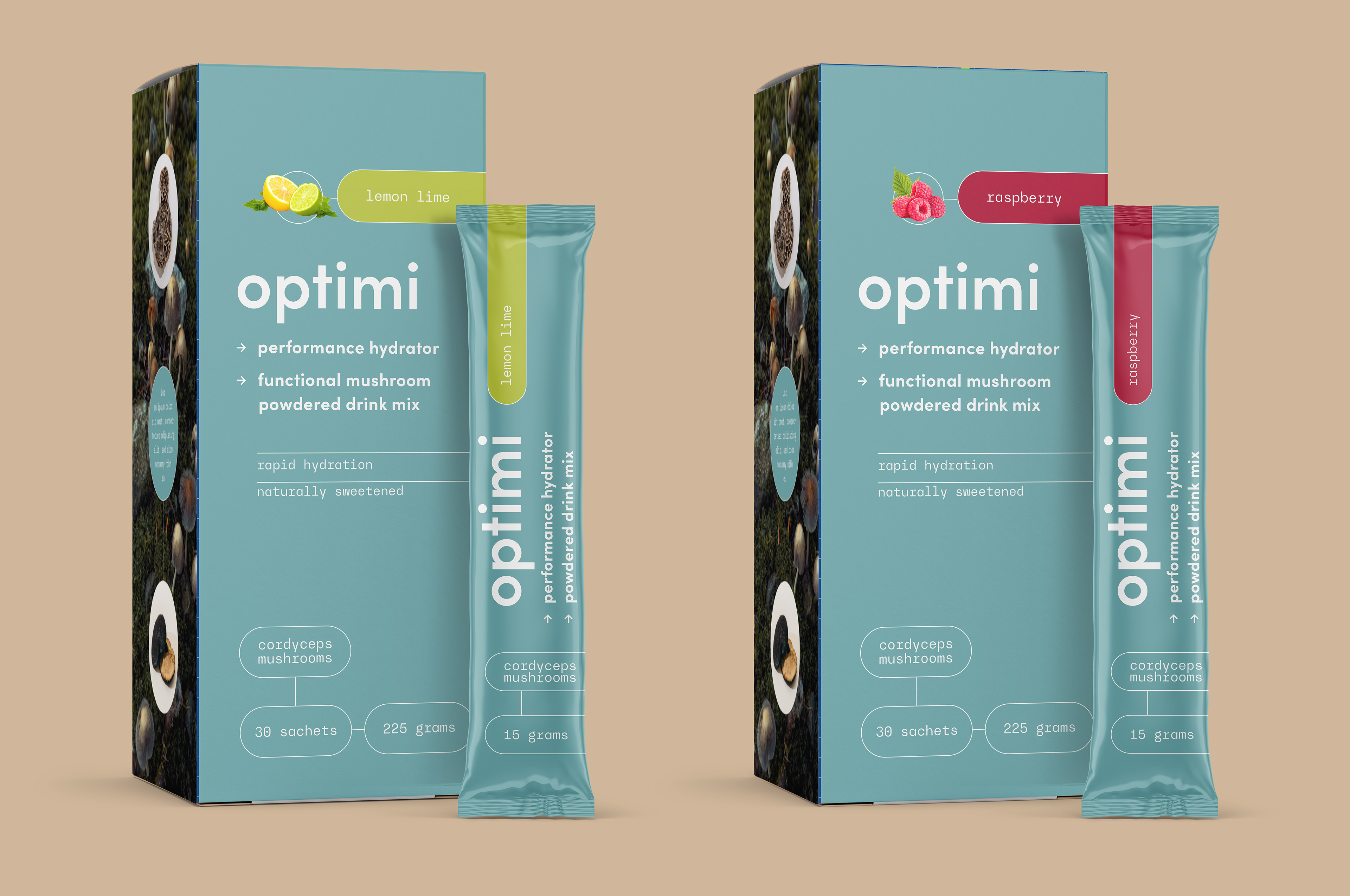
While the Hydrating Powders leaned more to 'functional', they still needed to be a bit more flavourful than the supplements, in way that respected what we'd established on the protein powders. The base colour related to the mushroom in the product, in this case teal, for their cordyceps products.
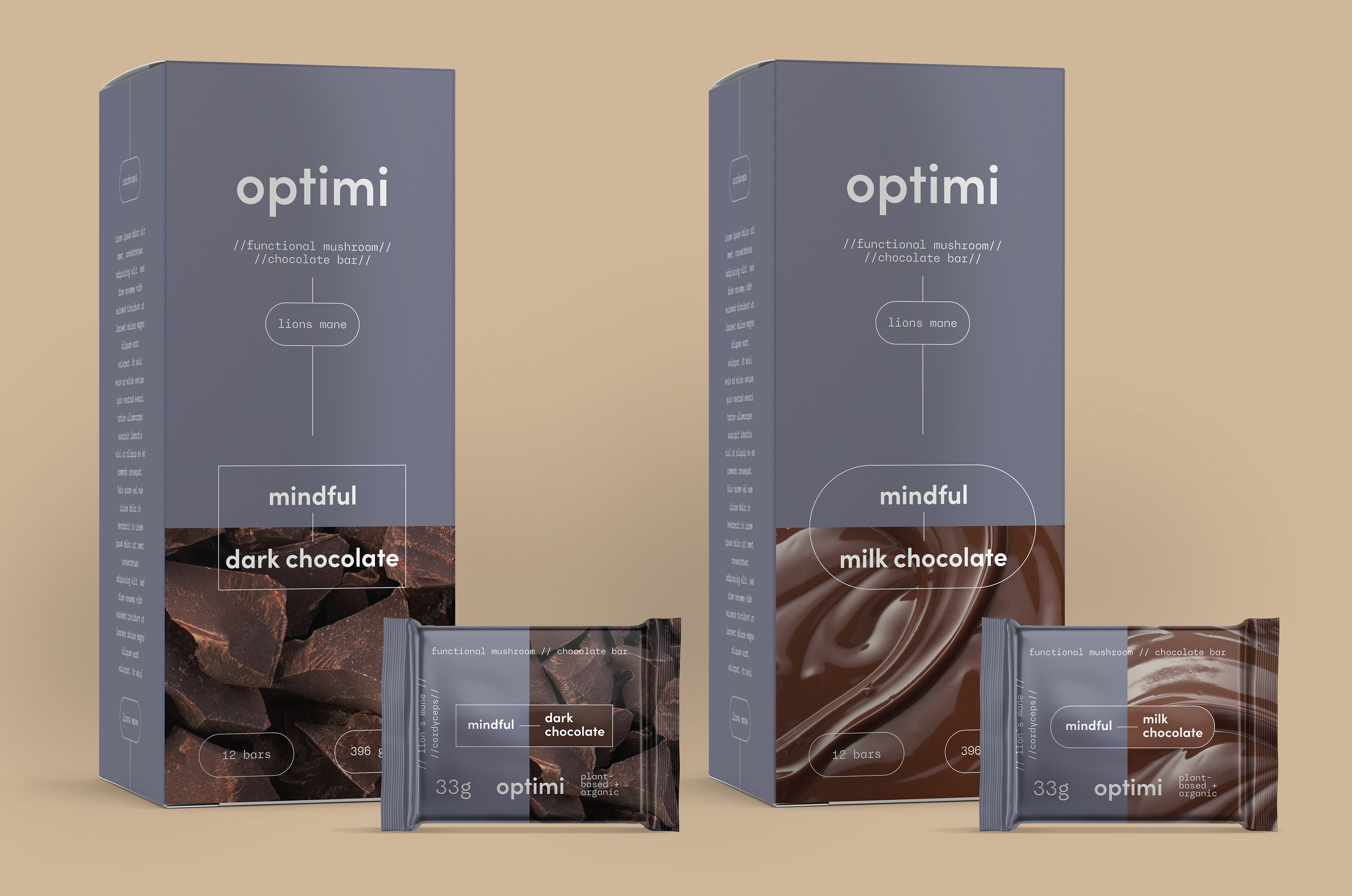
I recommended allowing the design of the Functional Chocolate products to be even more flavour forward, so to speak, as I believed flavour needed to be a much stronger message than function in this particular category.
So we adjusted the weighting of the main elements - the functional products had large areas of flat colour, with minimal photographic flavour indicators. On the chocolate, we went with much larger photographic flavour indicators, with proportionately smaller fields of colour (in this case purple, for their Lion's Mane products).
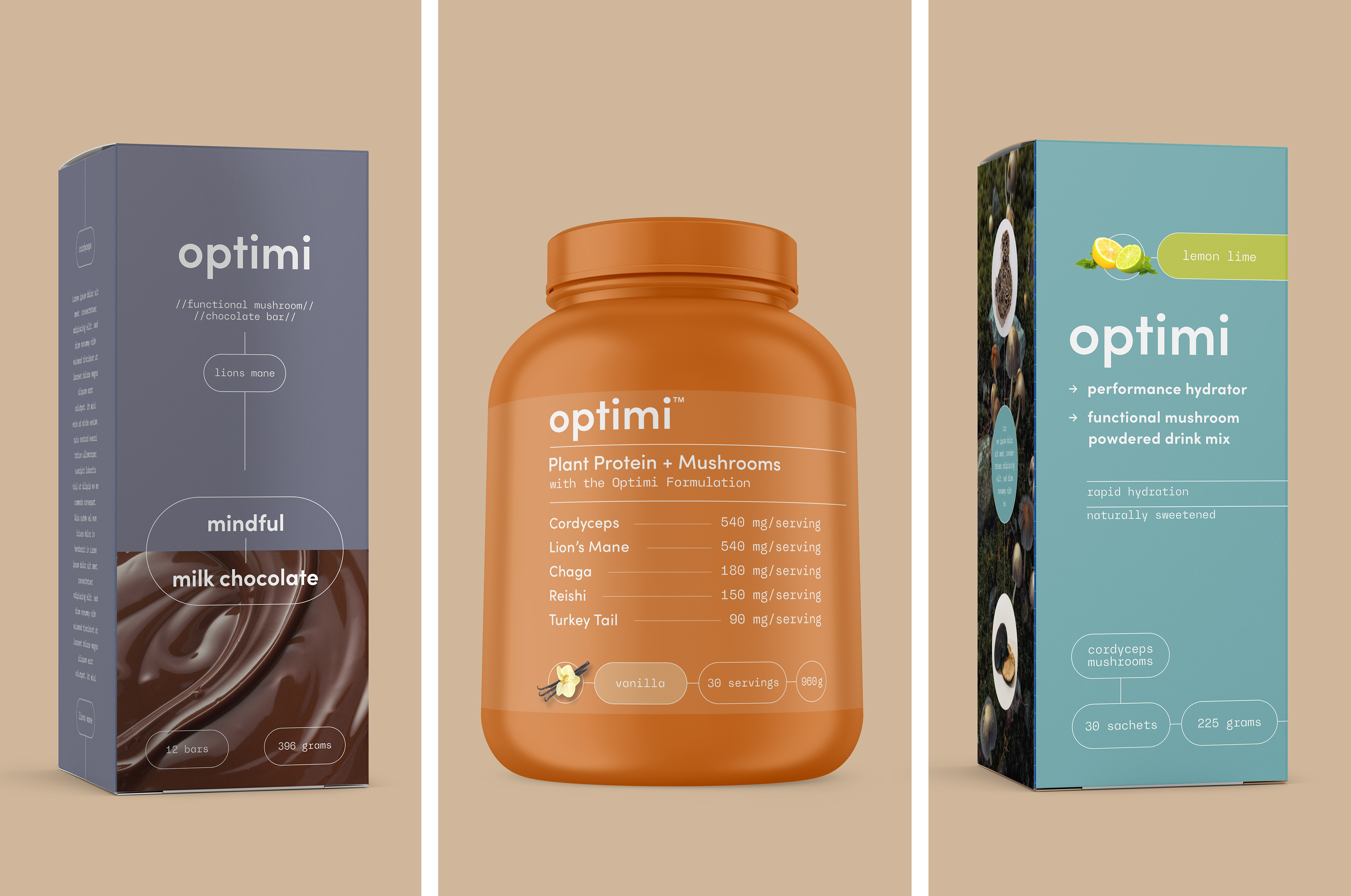
I believe we landed in place where they are all clearly coming from the same place, and respecting the brand rules and character, while still telling their individual stories, and doing their unique jobs.