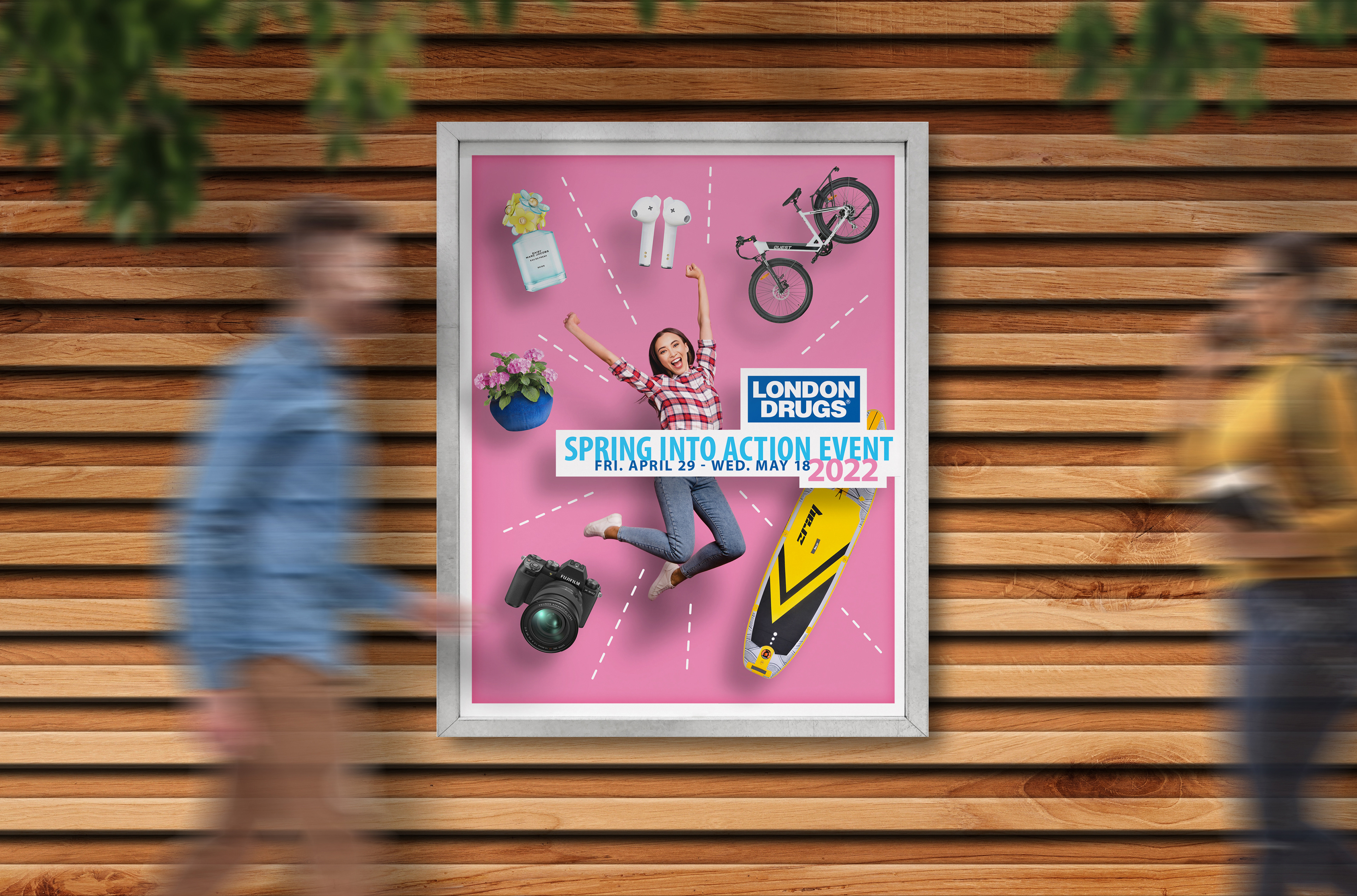
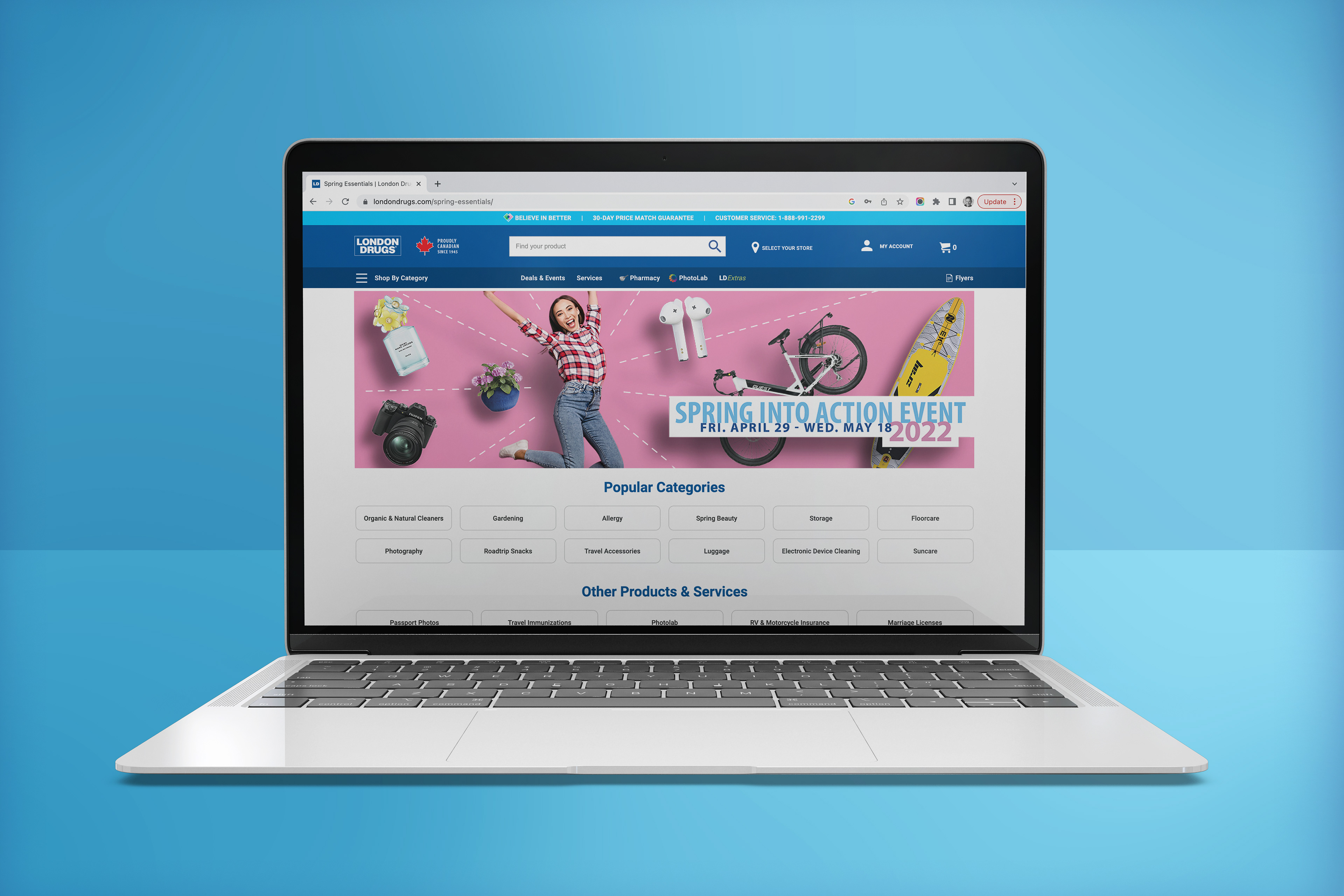
I was tasked with coming up with fresh creative for London Drugs' Spring Campaign, starting with the Spring Event catalogue, and then rolling it out to things like store signage and web banners.
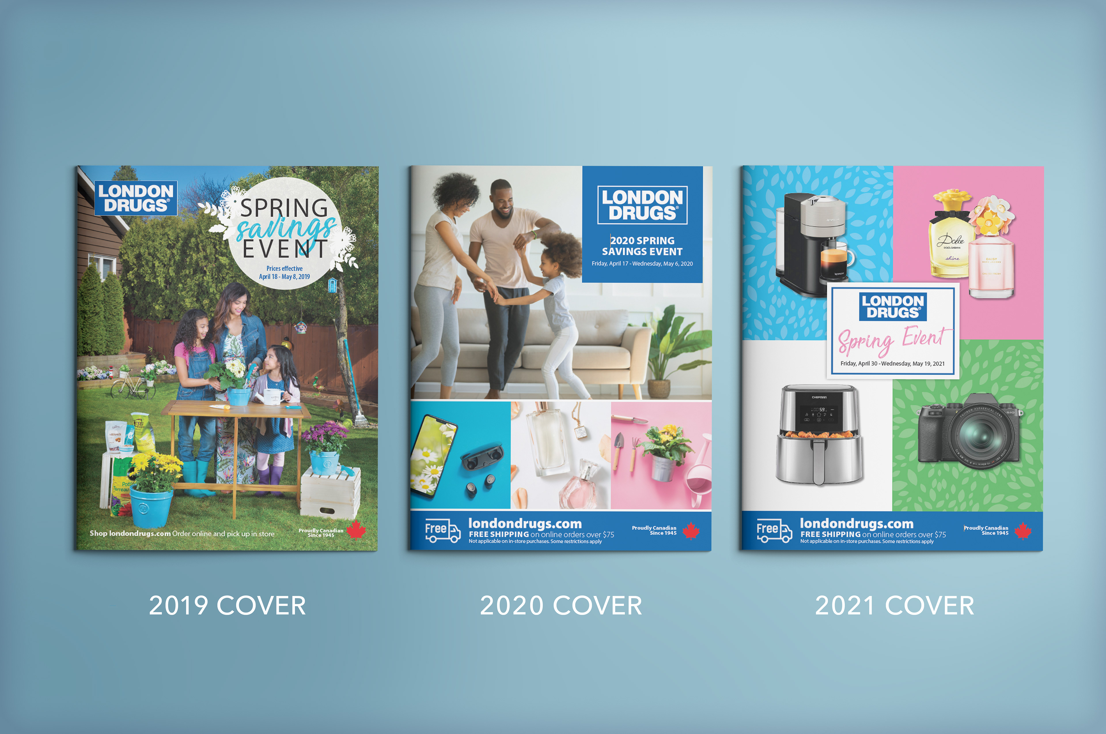
After reviewing their recent covers, I decided to pick up on the 'items in coloured boxes' idea, but I wanted to simplify it and give it more visual punch, and include the warmth of some 'human' photography.
The concept I'd been toying with, of a floating model interacting with floating items, all with dramatic shadows on a brand-coloured background delivered this nicely, but it also allowed for a recurring issue with the cover - last minute product changes. The fact that it could be easily created - and easily edited - in Photoshop, using stock photography and existing product shots, was a huge plus - and I didn't have to compromise on visual impact (when it came time to update the artwork the following year, it was very painless).
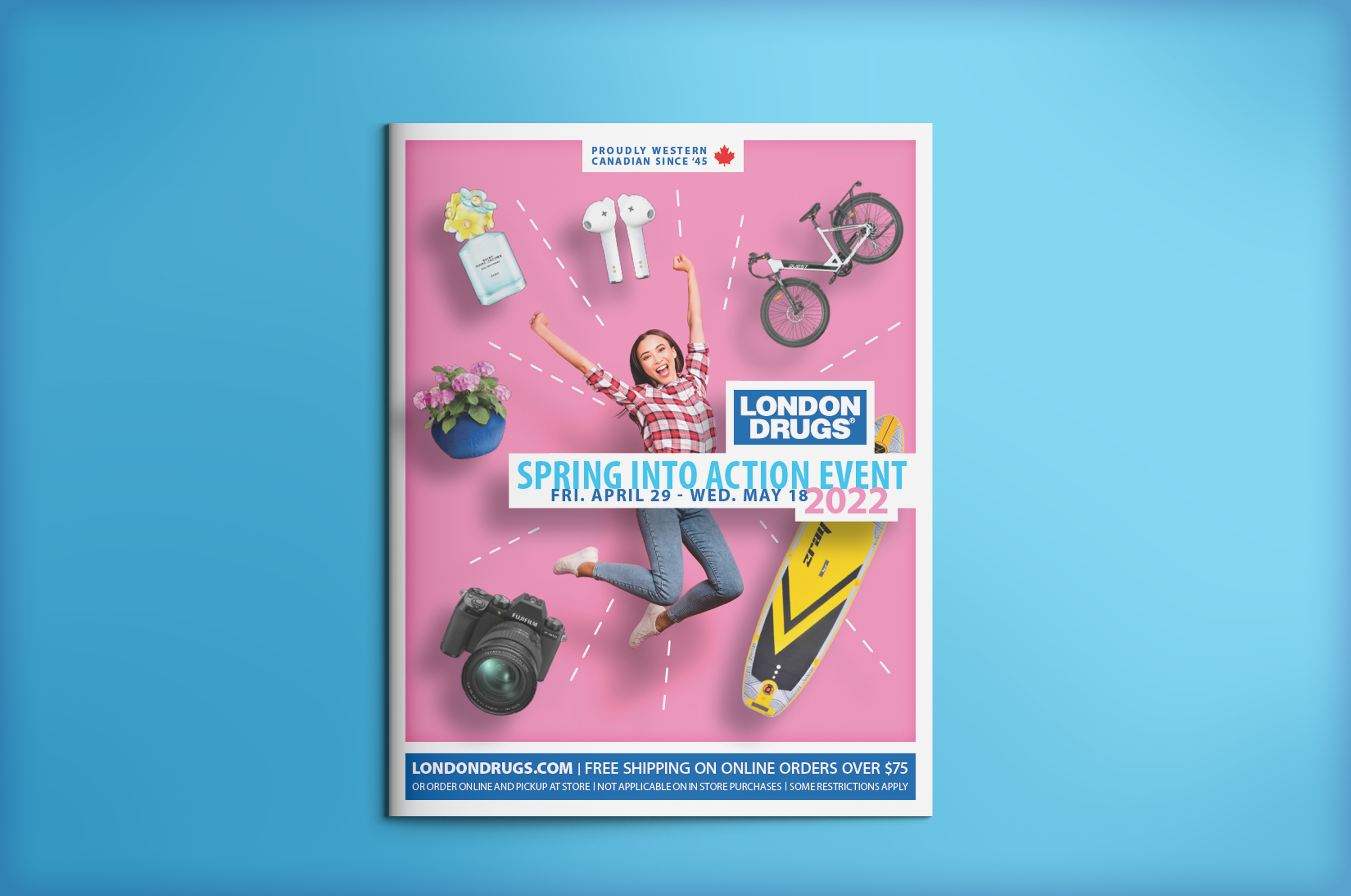
I also proposed we up the positive energy of the campaign (the 'Covid Winter' had been far from up-beat), and came up with the event title and the overall sense of movement and excitement.
I then also proposed having the 'We are Canadian' story more prominently displayed at the top of the cover, not hidden down in the footer bar, as we'd recently received data that consumers really resonated with our being a Canadian brand.
Overall, I'd say we landed with creative that was simpler, brighter, more engaging & energetic, and on brand - while still being easily produced (and reproduced) into all the required sizes and formats.
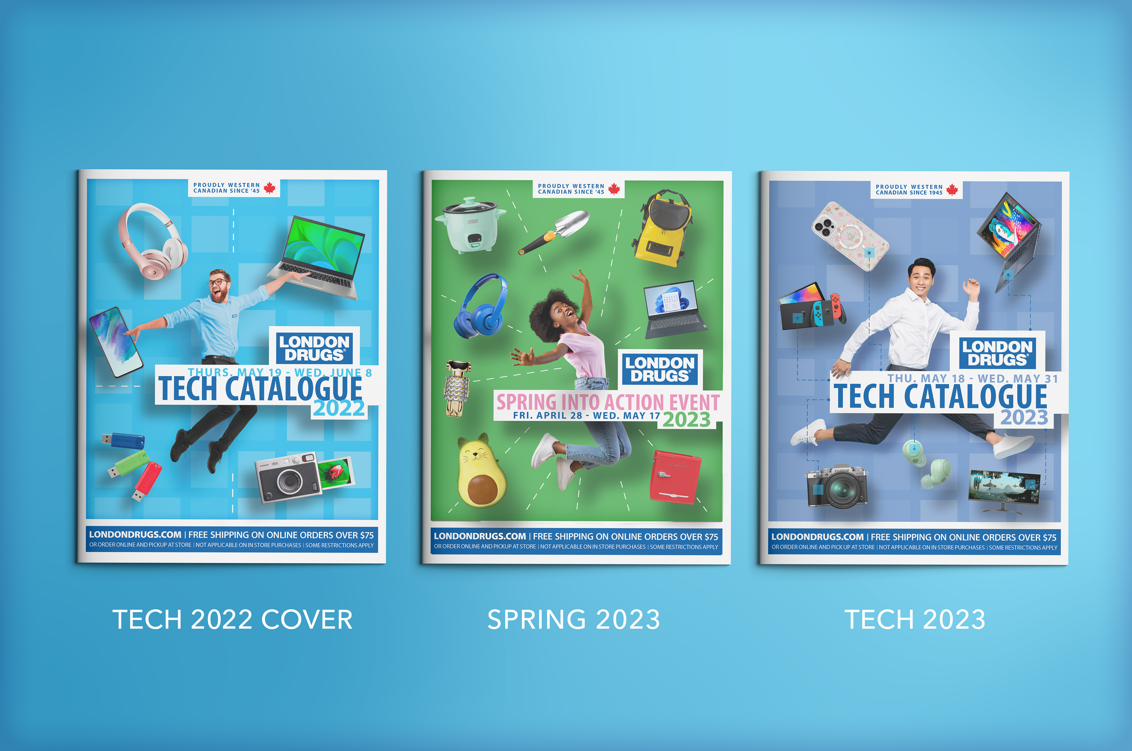
I believed the concept had enough legs to also be used for the tech catalogue cover that came shortly after; especially as they were meant to come off as ‘sister’ publications. And with just a bit of updating, they were both deemed still relevant enough to be used the following year.