The home page on the EKISTICS' website was looking a bit dated, and the video had had its day. It had helped communicate 'here's what our team and our office look like', but it wasn't showing our amazing work, which was really what people were coming for. It also really needed some brightening and simplifying.
The problem was, we were not in a place to make major changes, so it had to be easily attainable, and just be about the home page for the time being.
So I looked for ways to work within the existing structure, but still create a much cleaner, simpler site:
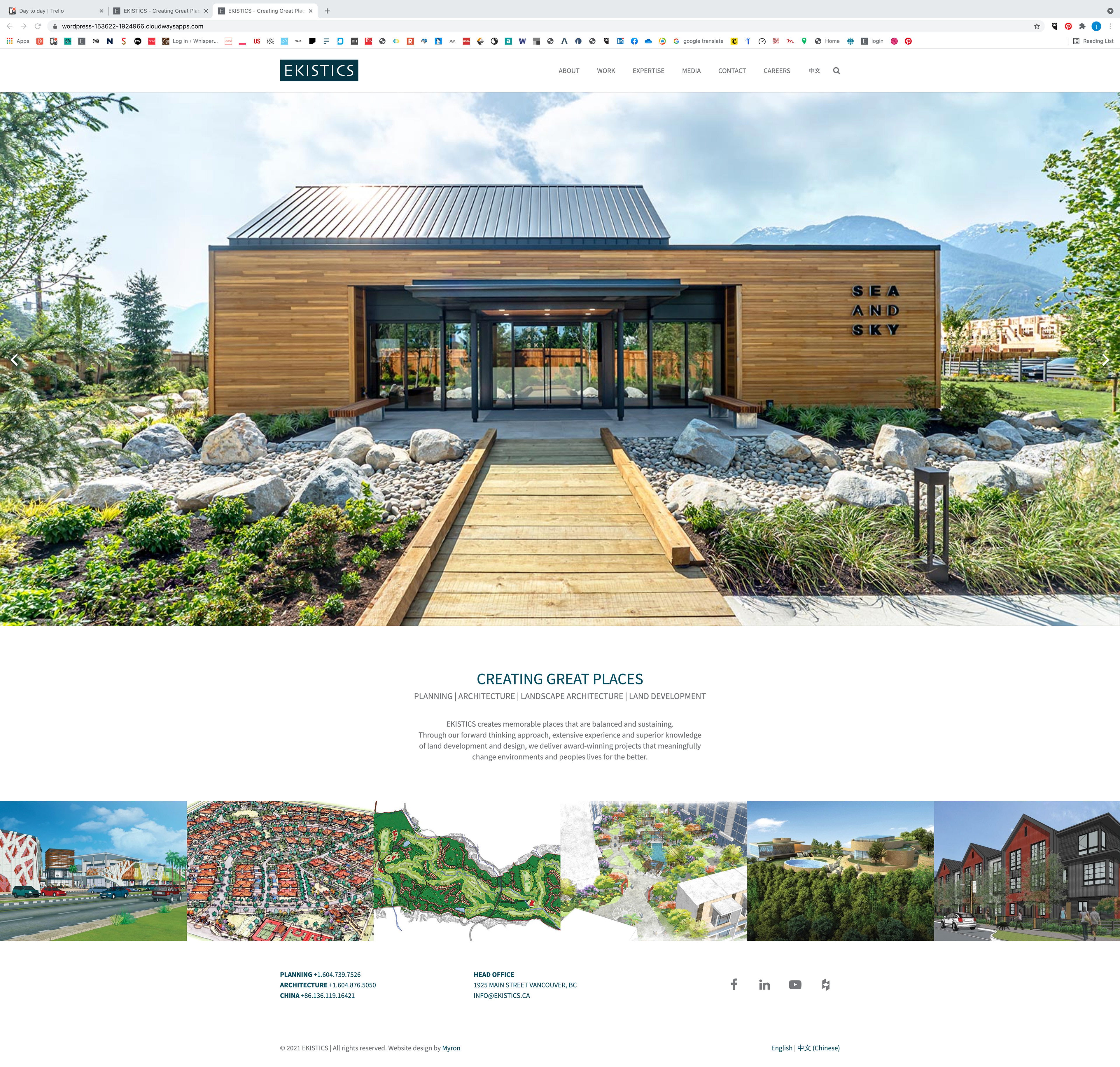
I selected 3 images for 'above the fold', one for each sub brand within the company.
The 3 images would carousel automatically, just shifting to left.
The overall effect is of a full screen image, with a white bar on top, similar to how it was just always ‘on’ (on the previous site, the bar only appeared as you scrolled down).
Logo is signature blue, not grey, nav type is grey, in Source Sans Pro (used throughout) all caps, type goes to black on mouseover.
Type in midsection edited to include type that was in middle of video, removed little lines/triangles.
Removed ‘check out our work’ (seemed obvious).
Sample images are color by default, turn white and name appears on mouseover/touch.
CTA about joining social media channels changed to contact info, in 2 columns (most comp sites had basic contact here).
Social media icons are in same position, but now grey as default, and black on mouseover to match nav at top.
Removed email sign-up, no one did, and hey, there is no newsletter.
Common white background throughout.