A series of pouch concepts for a local manufacturer of dried fruit products.
The idea was to play up the small, local craftsmen aspect that helps separate them from the larger players and be more attractive to tourists, and in a way that allowed for a bit of personal ’hand work’, while still being mindful of cost and labour.
HIPSTER FARMER’S MARKET
This option combines ‘Hipster Simplicity’ with a bit of ‘Farmer’s Market’ and ‘West Coast Rustic’, with the logo simplified a bit and printed in one colour to match. The label would be a long strip that hangs over the top, the back would have the nutritionals, ingredients, and the romance copy/founder’s type story. Ideally, it would be ripped along the bottom for an authentic feel.
It could be attached front and back near the base with adhesive, so it’s fairly loose over the top or the sticker could be used to attach at the front. The sticker would be printed with ‘made on ___ 2018’, and maybe space for the batch number, with the information handwritten as needed.

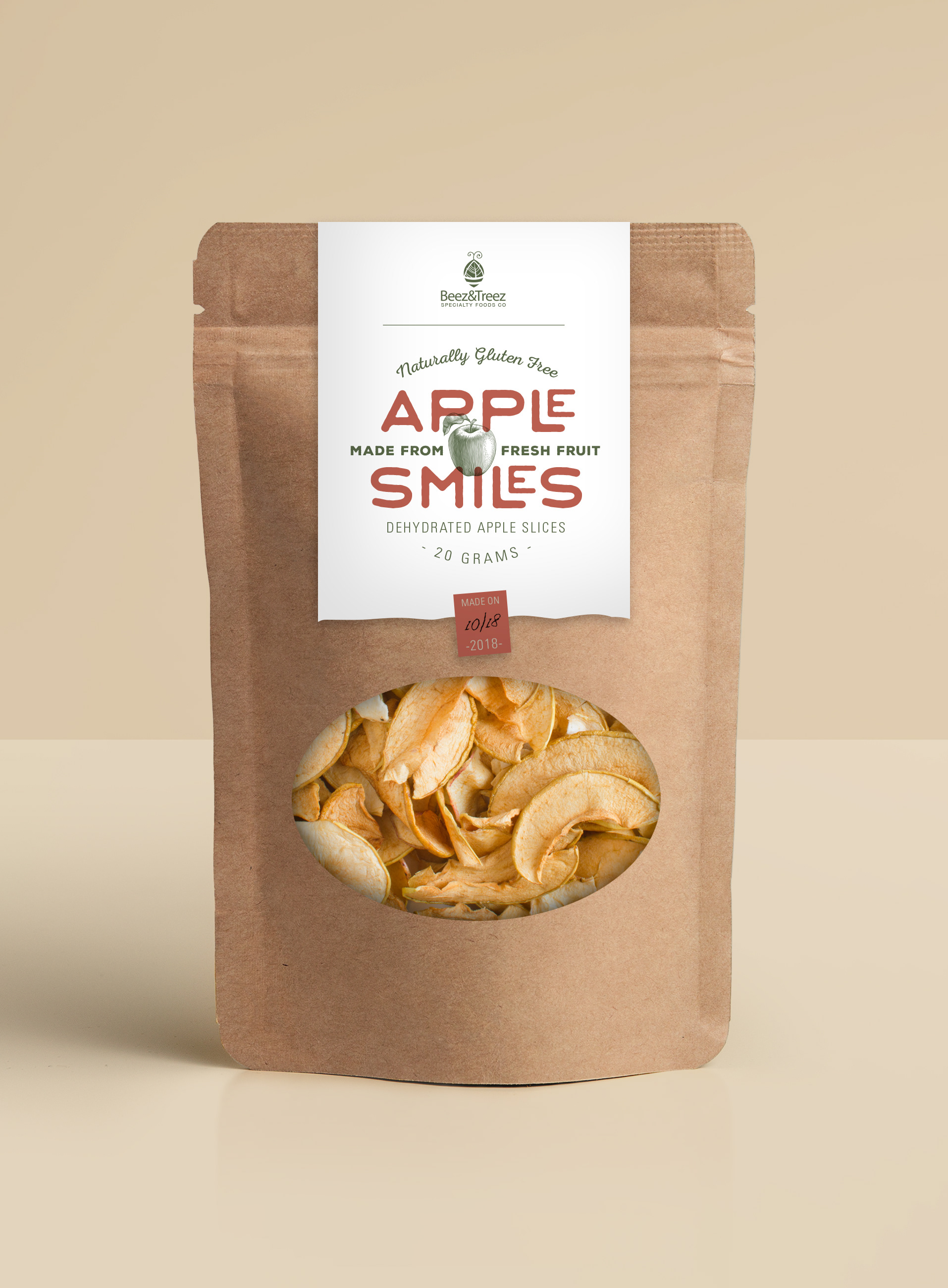
SIMPLY MODERN
Taking a cue from the (simplified) Beez&Treez logo, this one uses a very sparse, modern aesthetic. Similar to Option 1, the paper is a long strip that goes over the top with a ripped edge (on a bit of an angle). The logo has been printed in 2 colours and stacked on its side. The subtle illustration on the left side takes the lines from the leaf in the logo, and adds a bit of a West Coast tree/pine needle feel.
On this one, the date or batch # can be rubber stamped on the edge of the label to add a bit of hand-made character. The number in the centre can be handwritten or added with a basic stationery store date stamp.
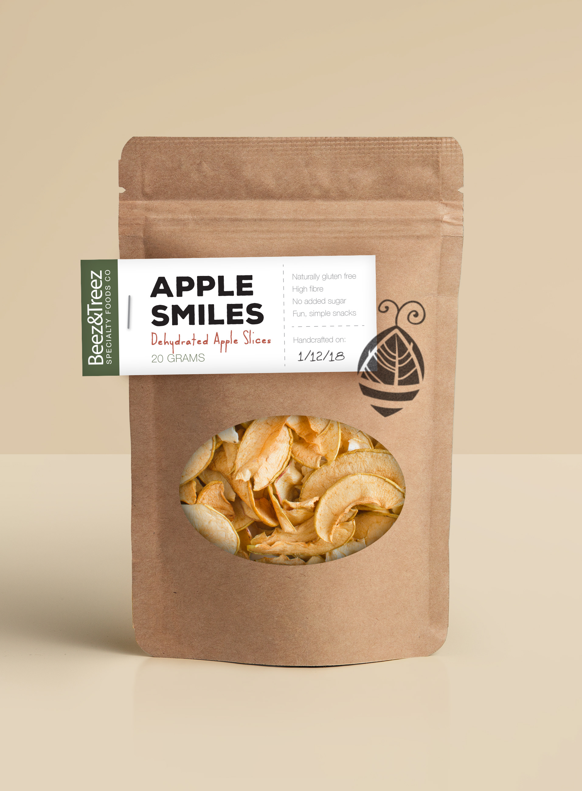
SIDE STAMP
Here, the label goes off the left side and wraps around, held on by a staple. The bee/tree icon is added on the right with a rubber stamp - black is shown here but it can be a different colour for each product. On the lower right of the label, the production date can be added by hand.

ALL STAMP
What if there was no label, what if there was a rubber stamp for each product, with a space for the date to be written in, and a second stamp for the bee/tree icon? The back could be a more standard rectangular label.
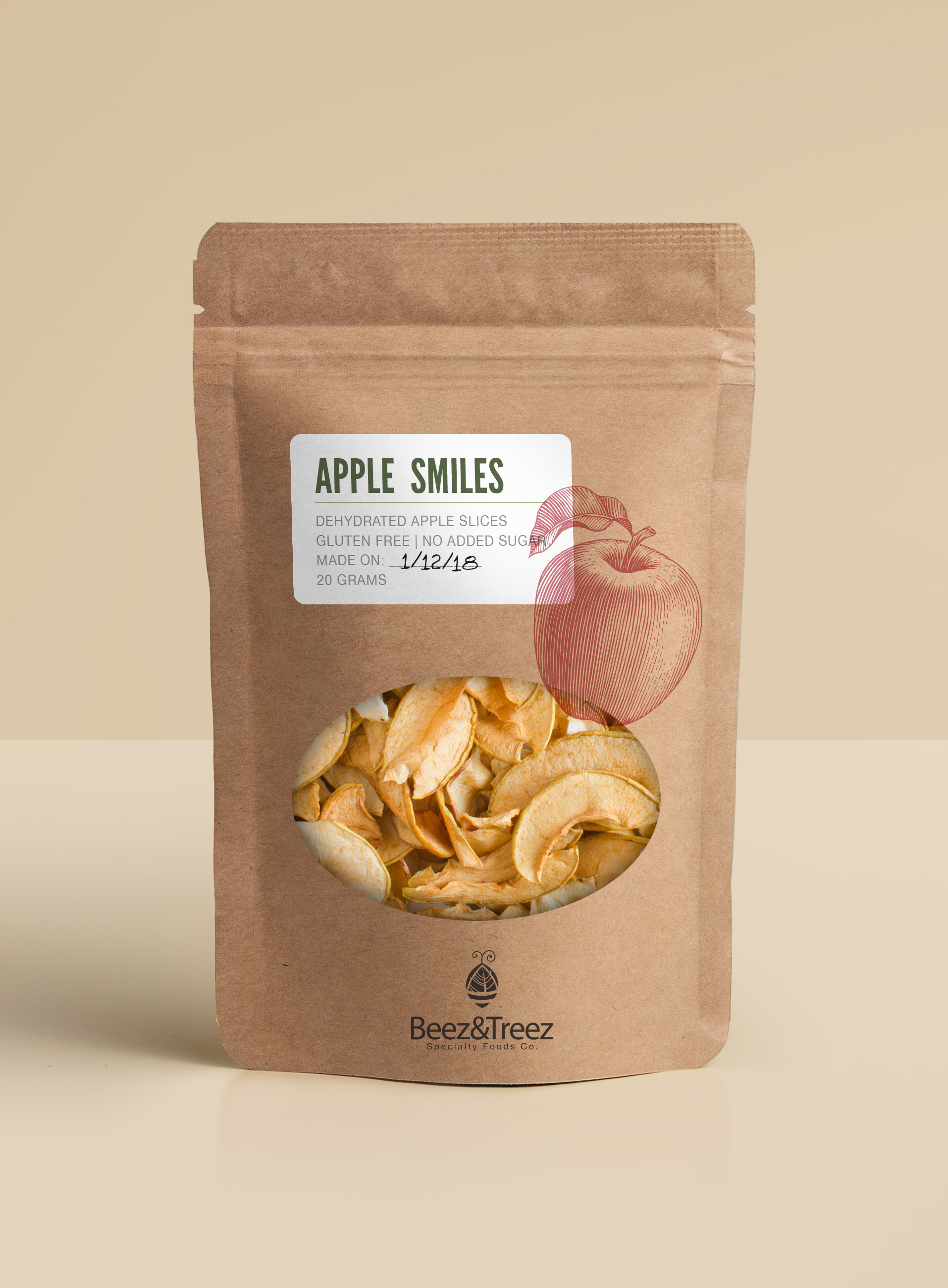
BIG FRUIT
A more conventional label is made special with a big, bold rubber stamp of the fruit being featured, because really, it’s all about the fruit (the tagline I came up with for the sell sheets? 'Just about fruit. Just about perfect'.)
A smaller stamp is used below the window for the logo, or they could be pre-printed.